Pictures help us make sense of data.
For example, when paleontologists unearth a single tooth, they can tell a lot about the animal it came from, including whether or not it’s a new species.
When they publish their findings for their peers, they will include pages and pages of data. But when the discovery is announced to the public, it will likely be accompanied by a highly detailed illustration of the animal in its natural setting. The pictured animal is based on the data, but if you didn’t know better, you’d think the paleontologists observed the animal in the wild—not just examined a single tooth.
A chart or graph can be a useful way to look at data. But again, it’s essentially a picture based on a careful selection of the data.
By choosing the units measured, the scale, and the density of the chosen information, the person making the graph can cause it to appear to support a conclusion that may not really be borne out in the data.
This is especially true for charts that illustrate a causative relationship between two things.
Researchers at Northwestern University conducted several studies to see how data visualization techniques (different kinds of charts) tend to influence people’s perceptions of the same data.
The first thing they found, unsurprisingly, was that charts and graphs can make people believe more strongly in a causal relationship between two factors, even though the data only shows a simple correlation.
For example, research has shown that kids who eat breakfast more often have better grades (correlation). But people viewing the right kinds of graphs will be convinced that eating breakfast causes better grades (causation), a result that has not been proved.
A second finding was that the less detail a graph shows, the more convincing it is of causation. This held true regardless of the type of graph used—bar, line, or plotted points. The mores imple the graph you show people, the more they are swayed to your conclusion.
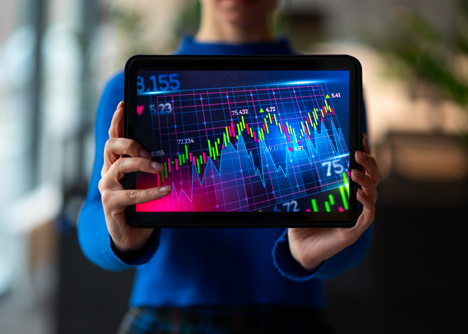
Financial charts and graphs can also be misleading. An investing guru with something to sell can choose just the right data framed with just the right parameters to make their speculations seem quite convincing. They are showing you “the facts.” Just not the whole picture.
As British economist Ronald H. Coase said, “If you torture the data long enough, it will confess to anything.”
It’s good to be educated about what’s going on in the market. But when you come across charts and graphs that purport to show how some future price movement or investment outcome is all but guaranteed, it’s wise to exercise caution and healthy skepticism.


